Context
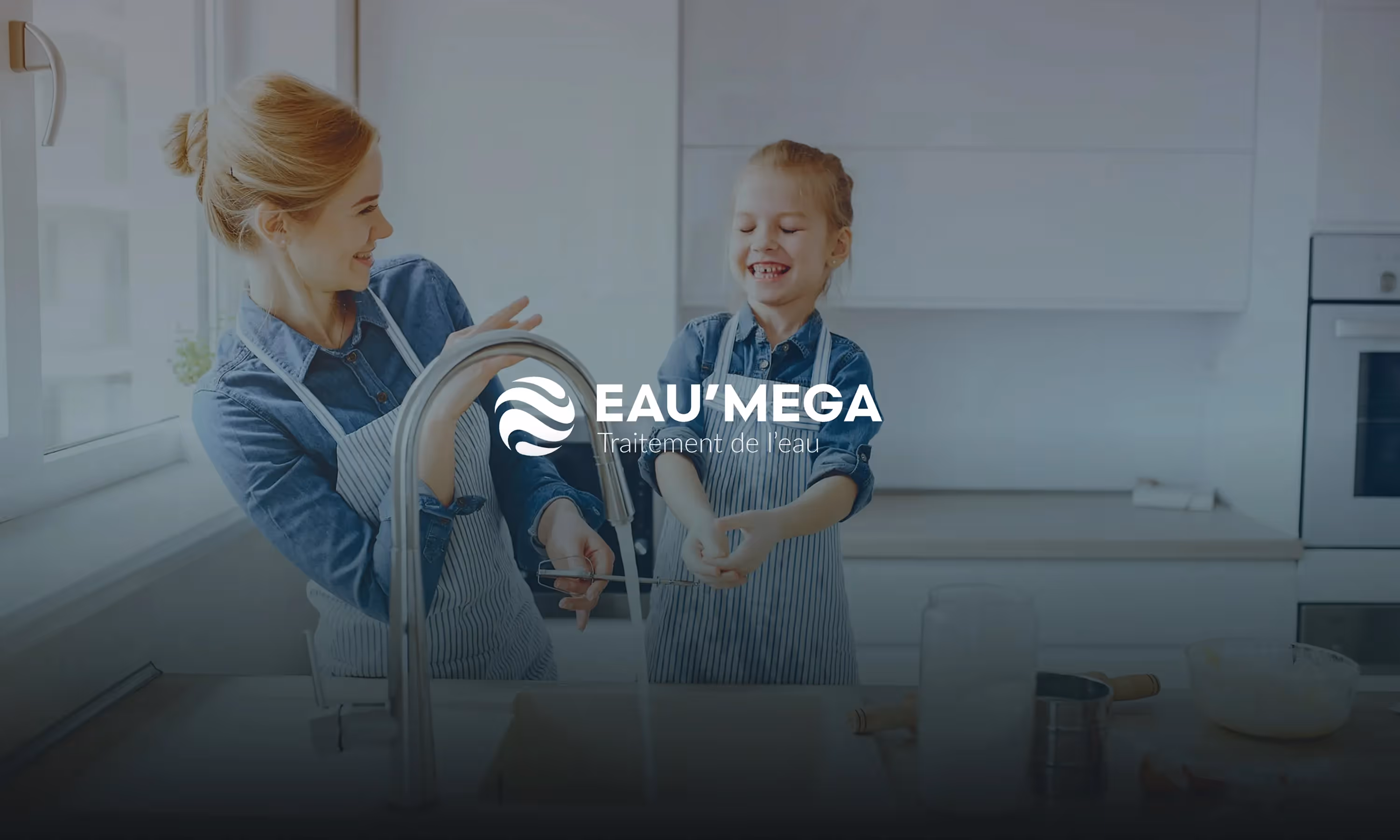
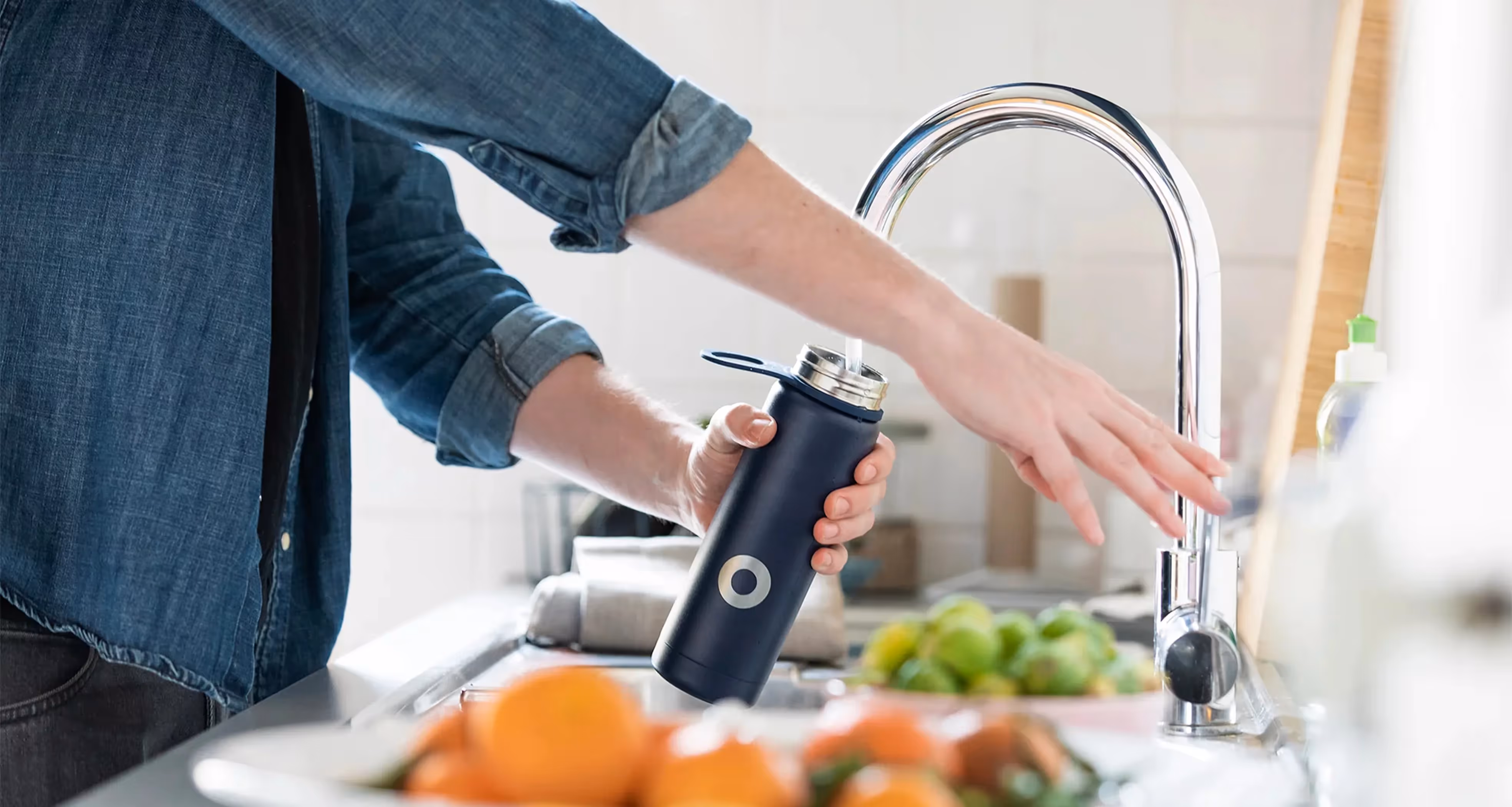
Specializing in water treatment, EAU'MEGA provides quality solutions to professionals, communities and individuals on a daily basis. Their offer includes softeners, purifiers and water fountains, combined with installation and maintenance services provided by qualified technicians. But the brand image did not reflect the credibility and diversity of the company. The need was to completely rethink the identity, from the brand discourse to the website.

“Nice work, thank you for the production and the support! Thanks to Noqode's expertise, our new visual identity perfectly reflects our values while clearly distinguishing our two activities. We are already seeing a concrete impact on our online presence. Thank you for listening, your responsiveness and your professionalism! "”
Issues
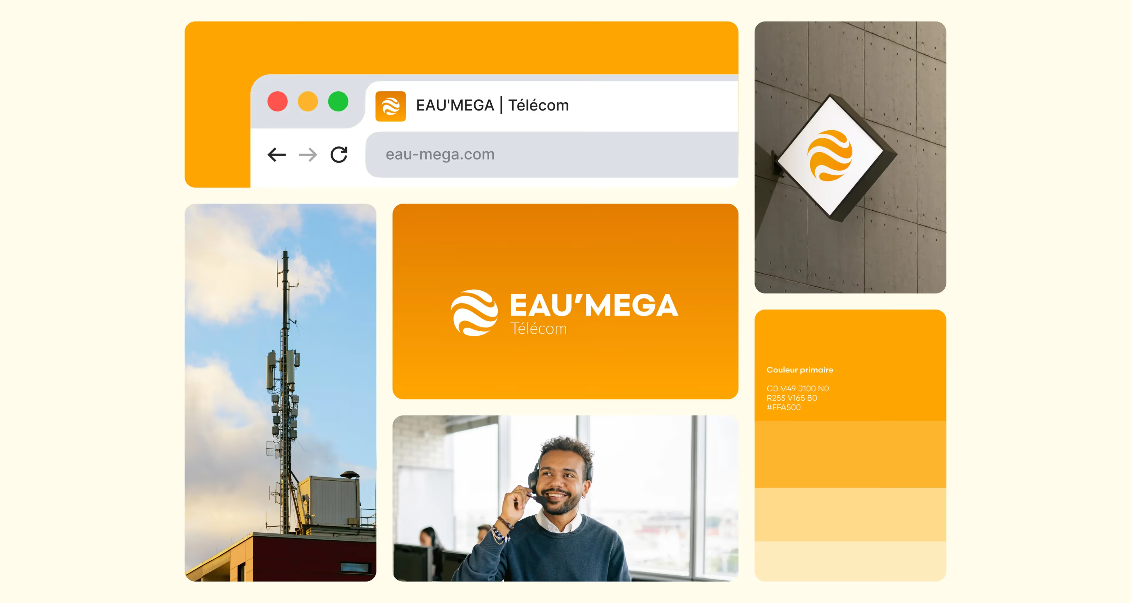
The challenge was twofold: to position EAU'MEGA as a human, professional and reliable company, while clearly differentiating its two main activities — water treatment and telecommunications — without losing brand coherence. The site had to embody this new visual identity and become an effective digital showcase.
Objectives
The mission aimed to strengthen the brand image by creating a strong graphic and editorial universe, reflecting the credibility of EAU'MEGA and its ability to support different audiences. It was necessary to develop distinct combinations for each activity while maintaining global brand recognition. At the same time, website optimization should provide a smooth experience, improve online presence and increase conversion.
Solutions
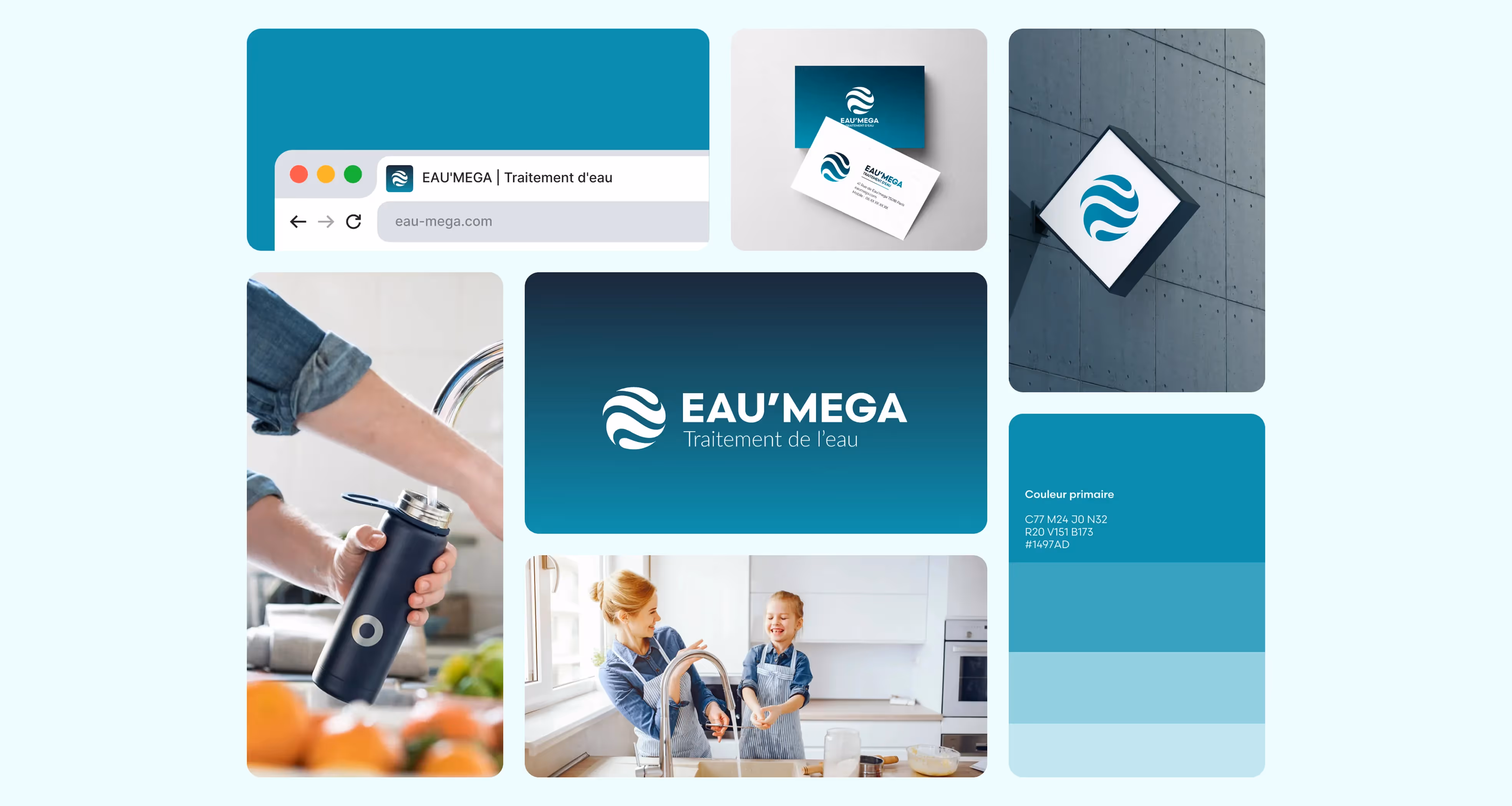
We have carried out in-depth work on brand DNA in order to define clear pillars: trust, expertise and reliability. The visual identity has been completely redesigned, with a new graphic charter, a modernized logo and variations adapted to each activity. The Webflow site was designed to embody this transformation, with an intuitive architecture and content oriented to reinsurance. Finally, the whole thing has been designed to offer a homogeneous digital experience, from navigation to interactions.
Impact/Results
The new positioning of EAU'MEGA offers a strong and differentiating identity, capable of speaking to a variety of audiences while strengthening the credibility of the company. The site now reflects the quality of their products and services, while promoting a professional and human image. This global rebranding gives them a solid base to develop their reputation and accelerate their growth.